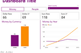
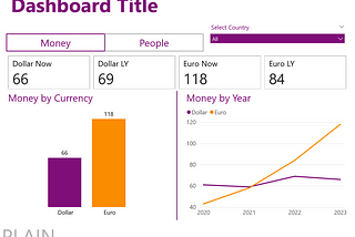
Martynas JočysHow to make a dashboard look cool (and still safe): 10 techniquesWhat if your client or stakeholder asks to make the dashboard you prepared to be more eye-catching, beautiful, or just cool? They are never…9 min read·Sep 5, 2023----
Martynas JočysMost dataviz best-practices fight one of those three enemies: what are they?You can find maybe 1000 articles with “most important”, or “golden” rules of data visualization and their set will be unique every time.9 min read·Jul 12, 2023----
Martynas JočysinNightingaleLet’s Bring Some Data Density to Financial PresentationsFive techniques to use ink wisely6 min read·Mar 2, 2021--2--2
Martynas JočysRadial charts with 6 online toolsI had lots of fun doing the same chart with different tools, so I was looking for excuse to make more of that.6 min read·Feb 6, 2021--1--1
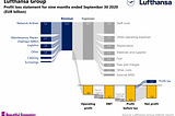
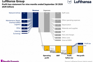
Martynas JočysVisualizing profit loss statementProbably of the most often visualized datasets in the world are profit-loss statements of corporations month after month presented to…3 min read·Feb 6, 2021----